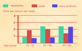
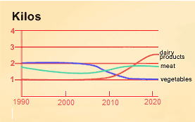
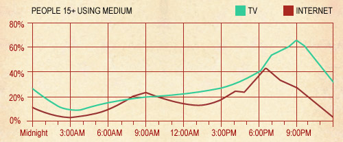
A: Interpreting visual information

In this group of exercises you will practise interpreting visual information.

TIP:

When you are interpreting and then describing visual information you will need to refer to the format that it is presented in. For example, whether it is a graph, a table, a chart, etc.

Remember: You must give a clear overview of the information that is provided, rephrasing the description that is given. If the overview is missing, your mark will be limited to a band score of 5.

1. Different types of visuals.

Look at different types of visuals. Choose the correct words to describe each one.

2. Charts and graphs.

Now choose the correct descriptions for each of the visuals below.

3. Describe the bar chart.

Look at the bar chart again and choose the best descriptions.

4. Describe the line graph.

Look at the graph showing the consumption of different food groups over the 30-year period. Match the descriptions to the lines on the graph.

5. Complete the description.

Now look at the graph again. Put the words in the gaps to complete the descriptions.

B: Describing visual information

In this group of exercises you will practise describing visual information.

TIP:

It is important to be familiar with the organisation and style of the texts for the two writing tasks. In the following exercises you will focus on questions and answers for Task 1 of the writing test.

Remember: It’s important to cover all the key features in the visual information, even if you just mention some of them. If you don’t cover all the key features, your mark will be limited to a band score of 4.

1. Read the question.

Read a sample question for Task 1 of the writing test.

The bar graph below shows the consumption of different food groups according to age in Australia. The line graph shows the trends in consumption of different food groups over a 30-year period.

Summarise the information by selecting and reporting the main features, and make comparisons where relevant.

Write at least 150 words.

Now answer the questions below about this task.

2. Read a sample answer.

Now read a sample answer to the question in the previous exercise. There is one piece of incorrect information in the answer. Can you find it? Select the incorrect information (one word). See the graphs again.

3. Descriptives.

Put the descriptives in the gaps to complete the text from the previous exercise. See the graphs again.

4. Cohesion and linking.

Remember you should write only about 150 words in your answer. To do this you need to:

  • avoid unnecessary repetition
  • link the text efficiently
  • remember to mention all the key points in the visual information

Now look at the sample answer again and choose the better options to complete it.

C: Review useful language

In this group of exercises you will review useful language for Task 1 of the writing test.

TIP:

To describe visual information you will need to use language of comparison and for describing tendencies. You will also be required to link this information in your text effectively and concisely.

1. Review useful language.

Now review useful language for describing visual information. Look at the examples. Then select the words to complete the tables.

There was a slight increase in temperatures.
Temperatures rose gradually.
Rainfall was steady.

2. Review language of comparison.

Now review language of comparison. Look at the example. Then select the words to complete the chart.

There was about twice as much rainfall as the previous month.

3. Practice.

Order the words to make more sentences of comparisons.

4. Practice question.

TIP:

Use the Task 1 checklist to make sure you fulfil all the requirements of the task.

Task 1 Checklist
Is it at least 150 words long?
Is there an overview that rewords the language from the task and clearly sets the scene? (What is it? Where? When?)
Have you mentioned all the information given?
Are the main trends presented and supported with data?
Is the tone appropriate and consistent?
Is the information well organised and linked?
Is appropriate vocabulary used accurately?
Is a variety of grammatical structures used accurately?
Is the punctuation correct?


Read a sample question for Task 1 of the writing test.

The line graph below shows the number of television viewers and Internet users throughout the day in the US in 2020.

Summarise the information by selecting and reporting the main features, and make comparisons where relevant.

Write at least 150 words.

Remember, you have only about 20 minutes to complete the writing task. Incorporate language you have practised in this section. When you have completed the task, check your spelling and grammar.

When you have completed the writing task, you can look at a sample answer. Compare the sample answer with your own.

According to the graph, a higher percentage of people in the US over 15 years of age watch TV than use the Internet, all throughout the day, with the exception of a brief period between 8 a.m. and 10 a.m. when Internet use exceeds TV viewing by a small percentage. At seven in the morning the percentages are similar, with the percentage of both TV viewers and Internet users at just below 20%. Both these percentages change little until 3 p.m. when the number of TV viewers and internet users rises sharply. Internet use reaches a peak of just over 40% around 6:30 p.m. before falling again until the morning, whereas the percentage of TV users continues to rise until 9 p.m., peaking at over 60% of the population. The most dramatic increase in the percentage of TV viewers occurs between 6 p.m. and 9 p.m. Over this same period, from 6 p.m. until 9 p.m., we can see that the number of Internet users drops steadily, falling to around 10% at 11 p.m. and then dropping gradually to approximately 2% at around 3 a.m. TV viewers, on the other hand, decrease from over 60% to a minimum of 10% between the hours of 9 p.m. and 4 a.m.